eDesk Design System

Team
Hayley Marjoram ~ Lead Product Designer
Seamus Breslin ~ Head of Design
Origin
A design system isn’t just a library of components—it’s the backbone that lets design and development scale efficiently and stay consistent. At eDesk, I built the eDesk Design System to bring some order to our process and make it easier for teams to design, build, and maintain products in a cohesive way.
This project highlights some of the components I created, but the real story is how the system became the framework for how our team works together. I started building it in January 2021, and it’s still evolving as our product and brand grow.
Structure
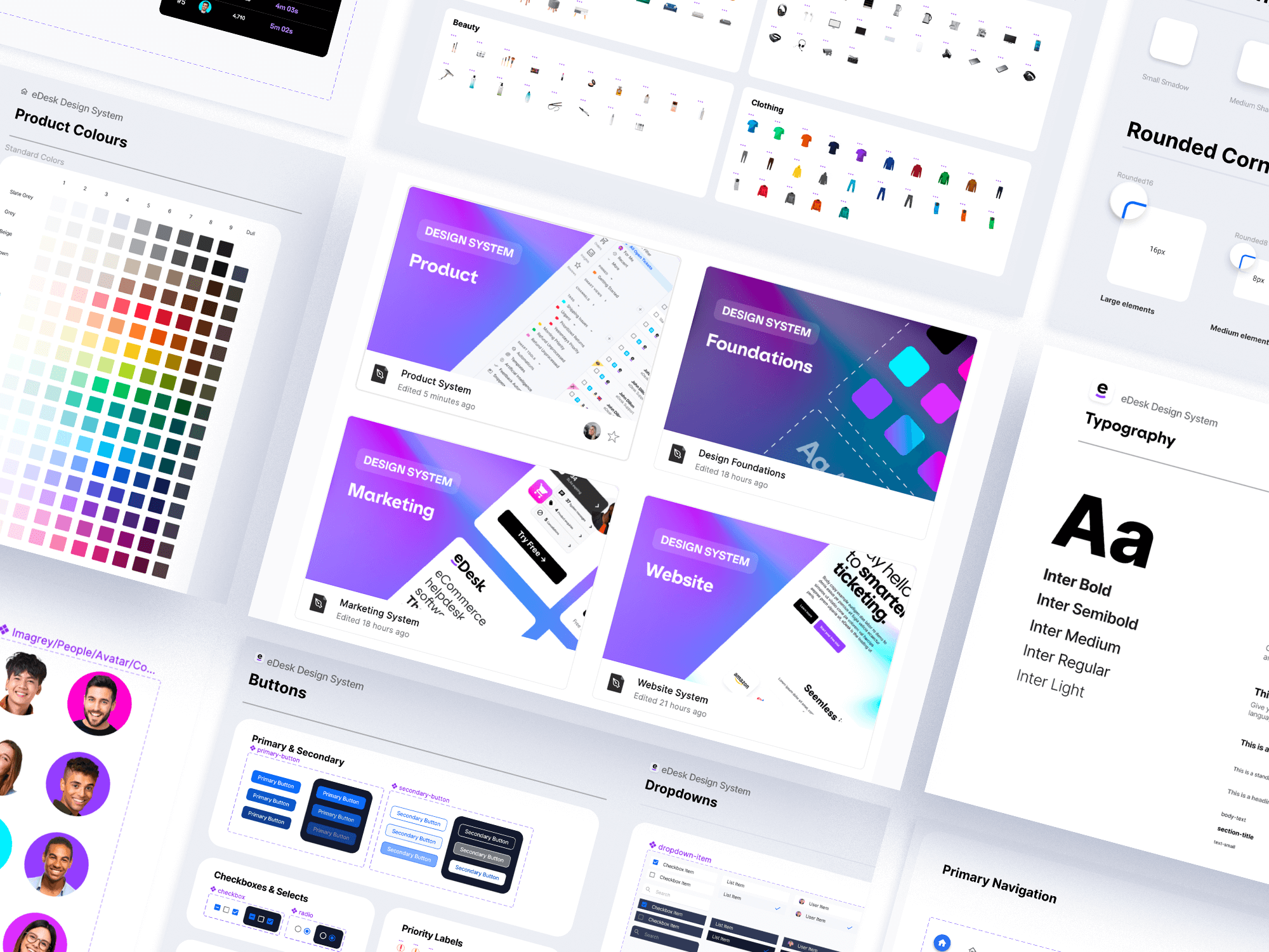
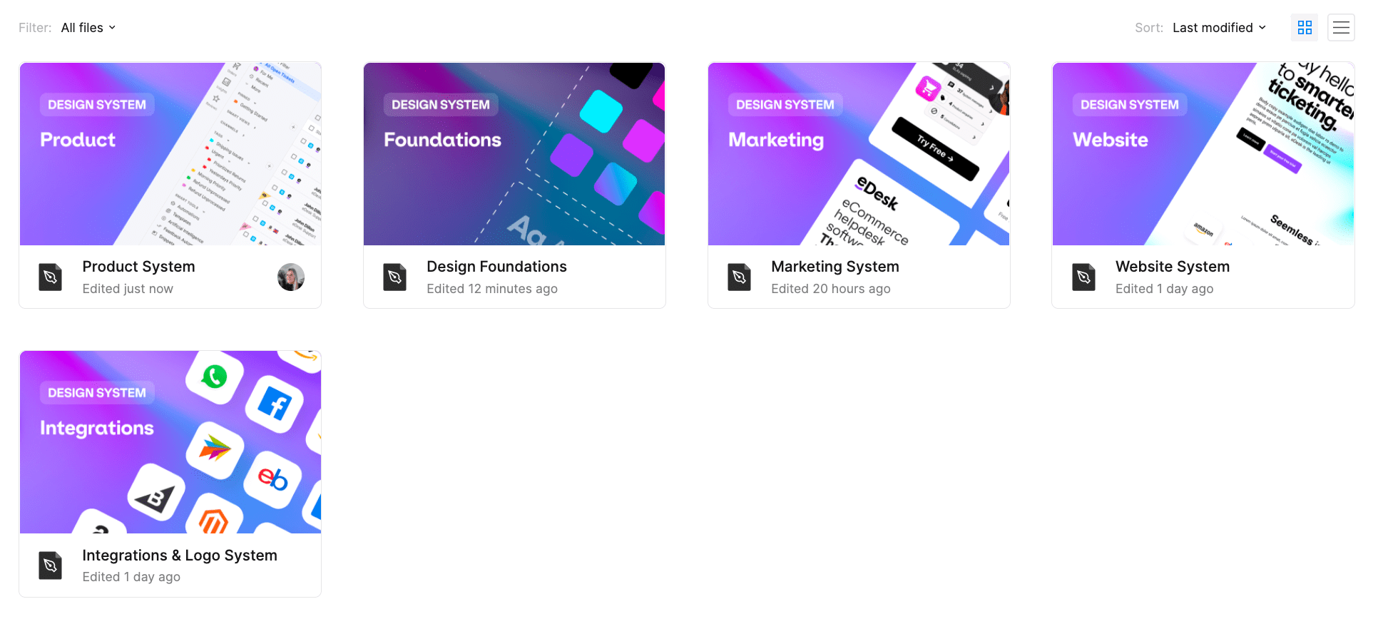
The system is built around five interconnected layers, all coming from our Foundations:
Foundations — typography, colors, spacing, shadows, borders, logos, and other core building blocks.
Web System — components for our brochure website.
Product System — components specific to our digital mailbox product.
Utilities & Guidelines — accessibility rules, responsive patterns, and interaction guidance.
Patterns & Templates — ready-made UI structures to speed up design and development.
This setup keeps the brand consistent while giving enough flexibility for different touchpoints.

Organization
Making the system efficient for both designers and developers was key.
- Clear, developer-friendly naming conventions.
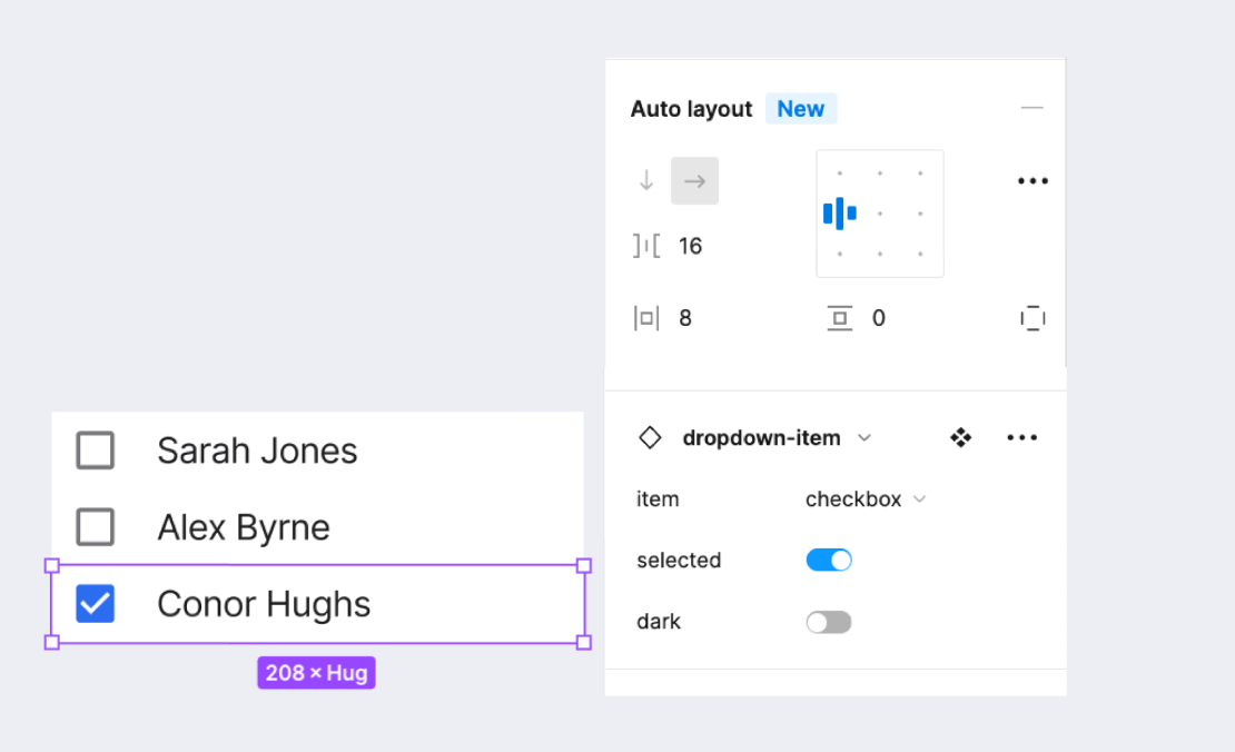
- Variants in Figma so you can pick states or behaviors without duplicating components.
- Auto Layout everywhere, which makes things scalable and reusable without creating dozens of different sizes.
It takes a bit of time up front, but it saves a ton of time later—faster iterations, smoother handoffs, and cleaner code.

Foundations
Typography
We chose Inter as our product typeface because it’s clean, versatile, and humanist. It works across headings, body copy, and UI labels, and keeps things readable and accessible no matter where it’s used.
Buttons
Buttons might seem simple, but they need clear definitions. At eDesk we settled on three types:
- Primary — main actions
- Secondary — supporting actions
- Disabled — inactive or unavailable
Each button also has clear states (hover, active, focus) so interactions are obvious and predictable.
Color
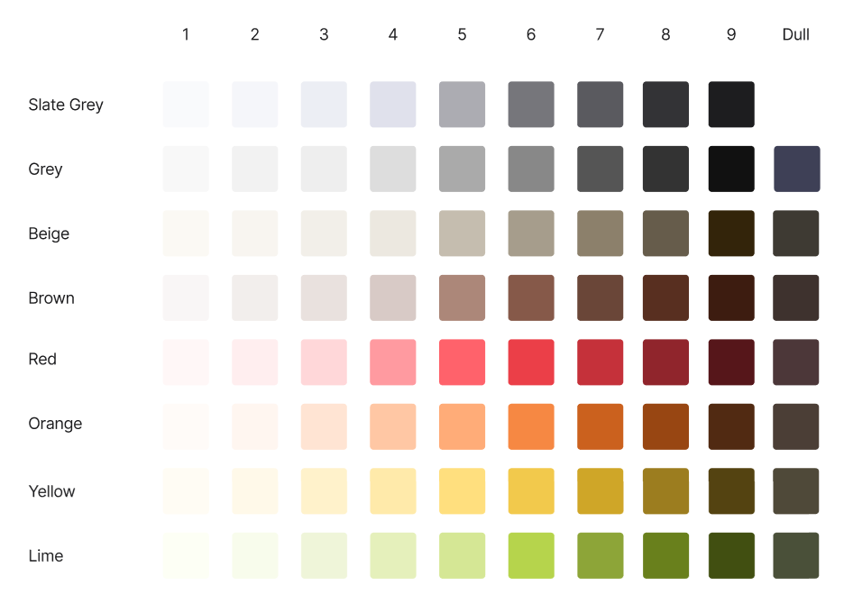
Color is about communication first, not decoration. Every color has a role—showing hierarchy, indicating interactions, or differentiating elements. This makes it easier to scale the system across multiple touchpoints while keeping flexibility for future updates.
